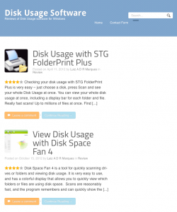
I just started using Definition – a WooThemes theme which looks nicer than my current theme (Inspire, also by WooThemes). Not only that, but it uses Responsive design, so it looks great on tablets and smartphones.

Currently it is only on Disk Usage, one of my microsites, but I intend to use it on this blog (and possibly my main site) soon.

There are two things I really like about WooThemes:
- Their themes are solid (every one of the PAID themes I tried had some major problem or another, sometimes several).
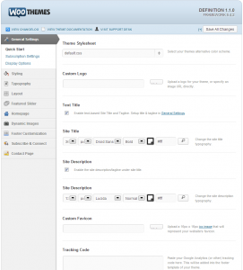
- Their themes have plenty of options, so it is unusual that you have to go down to editing theme files – which easily happened with other themes I have used. Check out the screenshot and note the side tabs – and most of these have more than one item!
Definition has not disappointed in these aspects, expect for a couple of minor things (a blue bar on the side of the title and Comment buttons when comments are disabled). I have contacted their support, let's see how they respond.
Update: a few hours after my support request they answered both my questions. I had an empty page that for some reason didn't show up on the other theme (so I just added a menu without it), and they sent the CSS to remove the button and divider:
.comments.button {
display: none;
}
.home .post-more-sep {
display: none;
}

