Categories
Product Review

XAML Jumpstart: Getting Started With XAML – Course Review

Just finished XAML Jumpstart: Getting Started With XAML, by Kevin Dockx.

As someone coming from Delphi and with no XAML experience, XAML looks very, very powerful compared to Delphi forms (of course some might say it is unfair to compare a tech that is essentially from 94 to one from 2006, and that the proper comparison is with Firemonkey now).

I love how easy it is to do complex composed elements with DataTemplate (which would require very annoying custom drawing in Delphi), and the data binding system to classes seems great. Clearly auto-resizing/adaptive design was a big deal from the start. And the animation support looks pretty cool, too.

I'd love to see the full WPF stack get implemented on Mac and Linux, too, like the CLR. But I haven't heard about any efforts in this area and from what I understand it would be far from trivial. (I know about Xamarin.Forms, but it is not exactly the same).

I also found this blog post by the teacher about the future of XAML to be interesting.

The course and examples were quite clear and informative. The only thing I'd mention is that sometimes I'd have trouble understanding the teacher's accent, but while on the PC closed captions solved this.

Official duration is 3h 14 min. I spent almost 5 hours, due to taking notes and trying out the examples (and watching the videos at 1.1x speed).

Pluralsight – short review

This is the first course I completed in Pluralsight. I really like it, they have a huge selection of courses for .Net (and many in other areas, too), fast loading videos, closed captions (on most courses I've seen, but unavailable on the iPad unfortunately) and video speed controls. Their Recently Added course list is quite large, too.

Not very cheap, though – US$29 or US$49 a month. Given that the exercise files are very useful for most courses – and can easily make you spend extra hours re-typing things to try them out – or worse, just end up watching and not trying – only the most expensive option (which includes them) makes sense. For most people, the certificates and offline viewing are useful, too.

Thankfully, I got a 30% discount and got the yearly option for US$349, which is much better.

I also had some problems with getting my account to work with the 30% discount, and support was very fast and quite effective.

Categories
Product Review

UX Design for Mobile Developers – Course Review

UX Design for Mobile Developers: Learn to Design a 5-Star Android App is an Udacity course about how to design your user experience for Android apps.

The course page suggest 6 weeks with about 6 hours per week.

Personally, I took the course in about 3 hours, but I mostly avoided using Prezi for the assignments. Prezi is used on the course to design cute boxes with the persona, their attributes, use cases and flows (how a user would perform a use case in the app). It looks like it would be lovely to wireframe the whole app and share with your team or clients, but for the flows it is actually used in the course, I think it is a whole lot simpler and faster to just use text.

I also had a rather simple app in mind for some of the assignments – a STG FolderPrint Plus extension for Android (yes, I realize for most people this doesn't make sense, I'd love to have a decent file catalog of my phone I can easily view and some people actually asked for it in the last survey). For anyone interested, I plan on making it for FPP 5.0, eventually.

There were some useful stuff in the course. They cover personas, use cases, several concrete ways to improve user flow (such as dropping forms entirely when possible) and the important constraints for mobile design.

The thing is, last year I saw another course that covered most of this elements and much more – App Making: Designing & Marketing Successful Apps (not an affiliate link).

So effectively, what I learned in this course was  fairly minimal. I was really hoping for more of best practices UI coverage of examples.

Overall, not bad for a free course, but if you'd like more on how to design and market your apps, App Making: Designing & Marketing Successful Apps (not an affiliate link)  is a much better resource – but you will pay for the difference.

PS: The course videos supported speeding up (1.25x feels great) and the closed captions are near perfect. Udacity also has an iOS/Android app, but it lacks those features on iOS so I didn't use it.

Categories
Product Review

Become a SuperLearner – Course Review

Become a SuperLearner is a course on speed-reading and memory skills.

I finished it several months ago, so I'm going to keep my review shorter than usual.

The memory and reading skills that are thaught here seem all very useful, but you do have to spend time practicing them. When I read an article using these techniques, that definitely improved my retention, but I didn't do all the practice recommended so far.

I didn't improve my reading speed with this course (around 600WPM). If you just want to improve your reading speed, get Ace Reader for PC, or even better, for the iPad (which is much cheaper and has all the same content).

Overall, recommended, but make sure to take the time to do the exercises.

Categories
Product Review

Developing Android Apps – Course Review

Developing Android Apps is a course by Google on Udacity that covers a lot of what you need to know to start developing for Android on Android Studio.

I took the course several months ago, but procrastinated writing about till now (I really wanted to go through my review backlog before New Years). I did the free version of the course – not because it was expensive, but the extra benefit seemed negligible for me and I was afraid that I might have to drop out due to my very poor Java skills (not an actual problem).

Thus, my impressions are definitely fuzzier than they should be.

The course was pretty good. Thankfully, I didn't start it just as it was released, but rather like a month after. So a lot of the initial problems were taken care of. Still, a lot of the time you'd have to read the instructor notes, and ignore most of the video as it was just plain wrong.

The course starts at installing Android Studio and setting up your Android device, all the way to developing a weather app that uses best practices to cache and download its data.

As an aside, I really enjoyed using Android Studio, despite some minor problems (including a time where it simply started complaining about nonsensical problems with my code until I forced a rebuild).

Overall, recommended.

Categories
Product Review

The Critical Website Components – Book Review

The Critical Website Components Series, by Sean D'Souza, consists of 3 short e-books:

The About Us Page—Why You Need To Throw Away Your Brown Paper

This is an interesting view into the About Us page. Sean is clearly a big fan of personality in this page, as well as having a photo or photos here, so that customers feel more confident and are more likely to trust you.  There is a lot of interesting advice here.

The Home Page—How To Put Sparkle And Pop Into Your Home

A view into how to create your home page. A couple of general layout options as well as graphic advice (the usual – create focus on what you think is important using space, contrast and direction).

Some more interesting advice on how to present your solutions on a way that will grab the attention of your potential customer. Plenty of examples.

My package also included a video with a short case study, that I didn't feel to be very useful (I have used heatmaps on my page before, and read articles on the subject, so it had nothing new for me).

Getting To Sign Up—How To Create A Clear and Simple Route For Subscribers

I thought this would be near useless (Sign ups are a whole lot less useful when you have a bunch of unconnected niche software like me, than sites like Sean's with new products that can be sold).

However, it has plenty of interesting details on not only squeeze pages, but also on creating reports – and packaging – and also on make engaging audio or video presentations.

How  To Maximise The Power Of Bonuses

This was a bonus (ironically!) to the package, that covers why and how to make product bonuses, while making they seem as valuable as possible. Very interesting views and tips! I also like the view of avoiding discounting your products and using bonuses instead – there are several places where I will not buy unless there is a discount as I know they have them frequently.

Conclusion

The home page and About us books had some interesting information, but for me the Sign Up and Bonuses ebooks were the most useful. As most of Sean's e-books, all were very fun to read and quite short and to the point.
Overall, at US$49 the package value was acceptable considering the bonus e-book, but I wouldn't recommend it otherwise.

Categories
Product Review

How to Create a Brilliant 3D Demo Video for Your Business – Course Review

How to Create a Brilliant 3D Demo Video for Your Business, by David Hawkins, covers all you need to know to make your own 3D animated video about your product or service.

Course Sections

  • Script writing
  • Storyboarding
  • Illustration
  • Animation
  • Voiceover
  • Sound Effects
  • Editing
  • Marketing/PR

Conclusion

The course is taught using several Adobe products (such as Photoshop, Illustrator, After Effects, etc), all of which have a 30-day trial available.

Included with the course are several files with many interactive PDF templates as well as several illustrations and projects.

If you are in a hurry, you will probably be happy to know that I could speed up the videos in Udemy (1.25, 1.5, 1.7 or 2.0). 1.5X is very watchable for me.

The 3D animation part is really something that can give an edge for your video.

Overall, the course is worth it if you can get a discount.

There is a very nice sale on Bits Du Jour for US$49 instead of US$347.

[big_button color=”blue” url=”http://stgsys.net/3ddemocourse” desc=””]Get the course for US$49[/big_button]

Check the video that is used as an example in the course below:


Categories
Product Review

App Making: Designing & Marketing Successful Apps – Guide Review

App Making: Designing & Marketing Successful Apps is a guide by Jeremy Olson. Jeremy is the founder of Tapity, which has a few well know apps that were featured by Apple as well as covered by the press.

I got the complete package (US$150 with the launch and App Design guide buyer discount). There are also other cheaper packages available.

The guide is hosted in guides.co. They don't allow for offline viewing, but it was quite comfortable to view on a tablet. The videos are placed on pages, which I believe is a better choice than many similar sites because it is easier to just display other resources, tips, action points and relevant screens in place.

They also have one very interesting feature – you can comment on each lesson, and it can be public or just readable for the author. So there is a mini-forum available on every topic. Personally I posted a question and got a response from the author very fast.

One complaint I have is that you have to log on a lot on the site – sometimes more than once a day. And they use a dual page login system that neither Chrome nor Safari (iPad) can just login directly.

Videos are mostly from a workshop, and quality is OK, although audio is sometimes a little hard to hear. Sometimes things are described (such as interactions on apps) instead of shown, which is somewhat frustrating.

It is important to note that while a lot of what is mentioned will apply to other platforms, the details are mostly focused on iOS and Apple.

The content starts with how to create and validate your app idea, and ways to brainstorm features so that you get a crisp design with a coherent, simple purpose.

There is some generic as well as useful advice on Interaction Design, prototyping and usability testing.

The Visual Design section is mostly simple principles (using proximity, alignment, contrast)but has some interesting tips, including icon design for iOS7 and 8.

There is a brief section on actually building your app, with an analysis of pros and cons of doing a native app vs a web based one, and a general idea of how much an app will supposedly cost.

What is probably the most interesting section is Marketing, which covers how to build relations with members of the press and app community, and how to pitch your app – which is similar to what I have heard elsewhere and seems like great advice.

There are some resources included, such as XLS checklists that you can fill in , pitch template and press lists, as well as market analysis and strategic design for Languages that are somewhat useful. Note that not all editions include this.

The complete package also includes the complete interviews with app developers, member of the press and more, that are included partly in the middle of the video part of the course. To be sincere, I didn't get around to watching them yet – a transcript would be great, as some were taken outside and the wind noise can make it very hard to hear (also, I'm a speed reader and a transcript takes a fraction of the time of a video).

The App Design Handbook – iOS7 edition by Nathan Barry and Jeremy Olson is also included in the complete version. This mostly covers the same material, but the sections on choosing controls for your apps, as well as how to use the iOS7 style are quite useful.There are more details in the icon design area, too.

Overall, I think it is a good investment if you are serious about creating apps. It is a little expensive without the discounts, though.

Categories
Product Review

Web Development CS253 – Course Review

What it covers

Web Development CS253 is taught at Udacity, and has a free version and a US$150 version – which has in-class projects, coaching and code reviews, as well as a verified certificate.

The course covers all basics on web development, and you will develop a very simple blog and a wiki by the end.
It uses Python and Google App Engine, which I think are excellent choices for a course and require relatively little setup.

The teacher is Steve Huffman, which is one of co-founders of reddit. It is nice to have a teacher with such experience, although he does warn you several times that Google App Engine is new to him.

The official level of the course is Intermediate, which assumes that you can already program in Python.

I have done a lot of web development, but mostly way back (1999-2002), using Delphi CGI, which is fairly outdated. I am planning on doing an overhaul on some of the systems in my site, and the course seemed like it would be useful.

How the course works

The course, as usual for Udacity, is a series of videos on YouTube (almost always with subtitles available), with quizzes in the middle. Some quizzes are simple multiple-choice, and same use an online Python IDE where you can type, try your solutions and submit them.

You also have separate homeworks, which technically can be built on any web development language you want – all tests are made by accessing the URL you specify. The course is all taught using Google App Engine and Python, though.

Content

The first part assumes that you have no HTML or server practice. You can skip a whole lot if you already do.
Soon you will write actual simple apps, use databases, add access control, use JSON and use Memcached to allow for much larger scale sites.
There is some very interesting coverage on how things are scaled on reddit and Udacity itself.

Python

I have to say that I didn't like the idea of a language with significant whitespace. But having used Python in this course and others, I have come to really appreciate how clean it looks. It is also quite easy to use for web development, and I understand it has nice frameworks (such as django).

Google App Engine

Google App Engine is an interesting option for hosting that many large companies use. The big advantage is that scaling is much easier, specially if you don't have experience with setting up multiple servers and doing load balancing on bigger loads. It can do a lot of that automatically. And a big advantage for the course as well as trying it out is that it is free up to a certain point – which you are totally not going to reach at this course.

It has improved a lot over the years and now supports several languages, instead of just Python as when it started. There are also a whole bunch of services you can use, but you always have to be careful because everything comes at a literal cost.

You still have to take care not to be bitten by eventual consistency problems, and I have noticed wild speed differences in response time, including responses freezing for more than a minute while the server created an index for a datastore with a couple of dozen entries (!).

Homework Checking

I had some trouble with the homework checking, and the forums are full of similar complaints. Basically, sometimes the checker will just say the things didn't work, making it a major problem to figure out what you did wrong. In some cases, simply resubmitting after an error got a version accepted.

On some other cases, the system pointed out what it tested and failed, and then it was easy to correct.

Conclusions

I thought this was useful, and it was interesting to see how CGIs work on Python and Google App Engine. The course took me about 30 hours, including all videos and homework.

If you don't have web development experience or if you are interested in learning Python or how to use Google App Engine, that feels like time well spent. I am not sure if the paid version would be worth it for me – I don't really have any use for the certificate at this point, but the in-class projects and code reviews sound like they might be useful.

I am still not sure if I am going with Ruby on Rails for my site backend or Python, though. 🙂

Categories
Product Review

Squirrly Review – WordPress SEO Plugin

Updated on 23/Jun/2021: the current product is very different from what I reviewed below. It has more features, but now is a monthly subscription (the old plan still works, but in a limited capacity). Also, I have tried the keyword features and they failed to work at all, just lost connection after quite a while.

Squirrly is another SEO plugin for WordPress. Yes, I do realize how many of those exists, but there was a sale on DealFuel.com with no monthly fees and the Squirrly reviews seemed convincing. There are 3 major features on the plugin – a keyword research module, a sidebar with details on SEO for your post, and content that can be added to your post that is related to your keyword.

Keyword Research

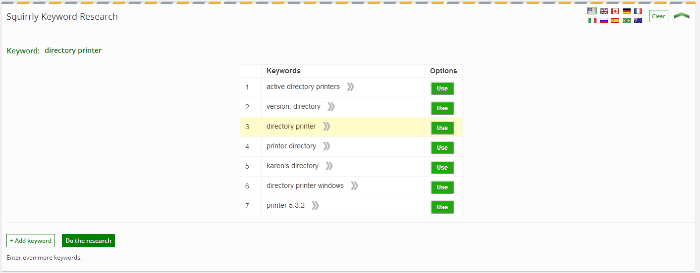
Keyword research is pretty fast, and it is easy to find the information, which includes competition. No idea on the source of the data, though – or if it is any good. At least I don't have to start a separate program and wait for it to run. I do wish the extra information was on a proper grid, though – it actually is on a pop-up per keyword.

My plan has a limit of 300 keyword searches per month. I imagine that will be quite enough for me. Naturally you will need to choose a keyword (or several) for the next features to work. Squirrly - Keyword Research

SEO Sidebar

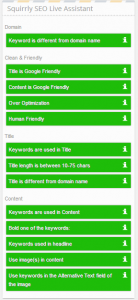
The sidebar didn't work at first, but after using Save Draft it worked fine. There is plenty of useful information in the sidebar, including most of the little stuff (keyword density, use keyword on H2, use Image with Alt for the keyword) that has been in similar plugins for years.

Squirrly - SEO Sidebar

Content

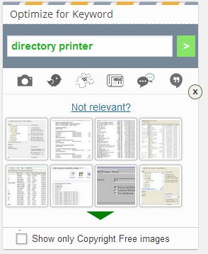
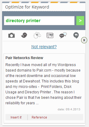
You have a bunch of choices here: Image, Wiki, Wiki, News, Blogs, My Articles. Images worked very fast and got me a bunch of relevant images. With a single click it is added to your article, with the Alt attribute already set for your keyword. I got some relevant stuff from the other searches, too.

Squirrly - ContentSquirrly - Articles

Audit/Monitor

There is some kind of audit of my blog that will take place in 2 to 3 days according to their site. I will update this review when it does.

The Squirrly site also says that I will get an e-mail with weekly tracking for articles, including “social signals”. Looks interesting. I already use Rank Tracker for some keywords on my sites, but I don't bother with the setup for individual articles. Again, I will update this article when I learn more.

Extra SEO Stuff

On settings, there are a bunch of stuff, including – add canonical link kin home page – add sitemap – add Facebook Meta objects – connect site with Facebook Insight, Bing Webmaster Tools, etc I have kept most of it off, as I already have another SEO plugin covering  this area.

Conclusion

Overall, I really like Squirrly, and it seems to work fine. Naturally, it is hard to tell if its suggestions are actually good for the article SEO or not., but these seem to make sense.

The tracking stuff looks wonderful, but I haven't seen it working yet.


Categories
Product Review

How to Be A Human Lie Detector – Course Review

How to Be A Human Lie Detector is a course about – you guessed it – how to detect lies. This is done by learning how to notice microexpressions, body language, voice changes and even differences in the language employed when answering a question.

The course consists of a few hours of videos, plus a few downloadable PDFs. The videos are light and pleasant to watch, and fairly concise.

Overall, it took me about 4 hours, although I really think I should go through some of the critical videos again to actually learn the stuff beyond a basic level. Recommended if you are interested in the topic, but I'd wait for one of Udemy's coupons instead of paying full price.