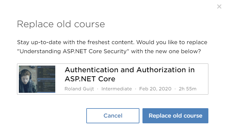
It is a small UI change, but with big consequences for the user:

When you are looking at channels (their version of bookmarks), “New Course Available” might appear. If you click on it, you get a box like this:

So you learn about the new course, avoid wasting time viewing outdated material and replace it on your channel in seconds. And if for some reason you actually wanted the outdated material (if you are using an outdated version of a product, for example), it is still there.
Very, very clever.
