
I have finished reading Beautiful Visualization a few weeks ago. It does have a lot interesting content, so I expect the review to take a while.
The book is composed of essays in visualization. Some are awesome – they are not only interesting, but can also teach a lot about the field. Others are just a waste of space. I'll comment on what I found interesting.
Chapter 1. On Beauty
Mostly generic, with an interesting section on the table of elements and some useful advice.
Chapter 2. Once Upon a Stacked Time Series
Useful advice on questions that can be answered with visualization and data sources, as well as an interesting practical data visualization.
Chapter 3. Wordle
Talks about Wordle, the word collage system, and some of the techniques that went into building it. Nice.
Chapter 4. Color: The Cinderella of Data Visualization
Lots of useful examples and very useful advice. Includes some R code.
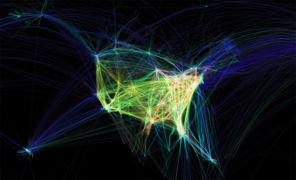
Chapter 6. Flight Patterns: A Deep Dive
Talks about Flight Patterns, a beautiful visualization of flight data.
Chapter 7. Your Choices Reveal Who You Are: Mining and Visualizing Social Patterns
Interesting view of social patterns – which I had no idea began in 1930. This leads to a cool visualization of book purchases on Amazon, for technical and political books. The way the book clusters interconnect shows quite a bit about the content.
Chapter 8. Visualizing the U.S Senate Social Graph (1991-2009)
Very good. Shows how the senate is divided between the parties using the votes as the links between senators. Lots of info on how it was built.
Chapter 9. The Big Picture: Search and Discovery
Graphics of queries for Yellow Page and the Netflix data set. Nice, with surprising conclusions and some insight on how to replicate.
Chapter 10. Finding Beautiful Insights in the Chaos of Social Network Visualizations
About SocialAction – a tool to generate social visualizations.
Chapter 11. Beautiful History: Visualizing Wikipedia
Several neat visualizations of Wikipedia edits.
Chapter 13. The Design of “X by Y”
A presentation of a visualization project of all entries to the Prix Ars Electronica. Some cool visualizations.
Chapter 15. This was 1994: Data Exploration with the NYTimes Article Search API
Nice view of the Times API – and some awesome visualization using the data.
Chapter 16. A Day in the Life of the New York Times
Neat visualization of the NY Times readers
, and a great view into the process of creating it.
Chapter 19. Animation for Visualization: Opportunities and Drawbacks
A big view into various animation possibilities on visualization, and how well they work. Plenty of advice and examples.
Conclusion
Overall, I strongly recommend the book for anyone who is interested in visualization. There is plenty to see and learn in this book.
Note: Some people complained about the images in the PDF version being too small. I read the book on an iPad, using Kindle (Mobi format), and you can zoom into images by double-tapping them (you can them zoom and scroll). They looked fine.