Categories
Articles

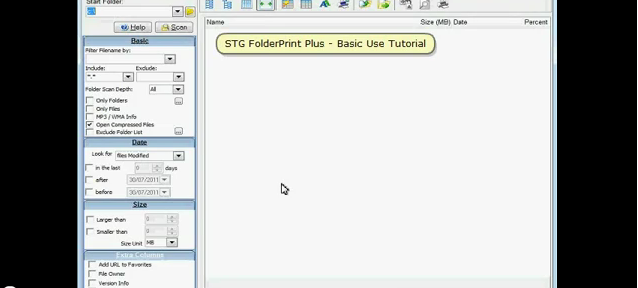
New Tutorial/Demo for STG FolderPrint Plus

I have been putting off making new tutorials/demos for STG FolderPrint Plus, but the old one was from 2003, and it really showed.

So this is the new flash basic demo , made with Instant Demo, as usual.

I've also posted a version to YouTube:

I intend to add many more videos in the future, showing other features of FPP as well as other programs.

Categories
Software Release

STG FolderPrint Plus 3.84 released

STG FolderPrint Plus 3.84 is now available at http://www.stgsys.com/files/stgfpp.exe.

3.84 (21/Jul/2011)

  • Improved maximum memory usage on 64-bit systems.
  • Added Registered to notice to main form title.
Some users scan large volumes of data – several million files. STG FolderPrint Plus can easily handle this, but sometimes that can be more than the 2GB it used to support. Now, if you are using a 64-bit OS and have enough memory, STG FolderPrint Plus can use up to 4GB.
I've also added the user number and number of license to the title bar. Some users weren't sure if the program was actually registered, this should help.
Categories
Book Review

Smashing CSS: Professional Techniques for Modern Layout: Book Review

Smashing CSS: Professional Techniques for Modern Layout – by Eric Meyer covers a number of techniques, tools, tips and tricks on using CSS. The book is very clear about the level of the reader – advanced beginner to intermediate.

If you are really advanced, you will probably know about most tricks, and if you are too much of a beginner you will probably be confused most of the time. This is not a CSS starter book.

The book is divided in 3 parts:

Part I- Fundamentals

Chapter 1 covers a number of tools, such as Firebug, Diagnostic Style Sheets, Reboot Styles and IE9.js. There are many interesting points made about the tools, and it can be very useful if you don't know all the tools (I knew some, but not all of them).

Chapter 2 is about selectors. My (Kindle) chapter is heavily underlined and bookmarked. Several good tips and explanations on the finer points of pseudo-classes, pseudo-elements, attribute and child selectors.

Part II  – Essentials

Chapter 3 – Tips – has tips on a number of areas, such as server-specific CSS, styling the html tag, indenting and outdenting lists, and much more

Chapter 4 is all about layout. Most ideas on how to do layout here (mostly ways to do different kinds of grids) are available on the web, but I found the overview and discussion to be useful.

Chapter 5 – Effects has a bunch interesting effects you can achieve with CSS. A few are outdated by CSS 3 but are still presented.

Part III – Cutting Edge

Chapter 6 is all about tables. Mostly about different ways of styling (which are much better than the class heavy ways I've used on the past). There are also two very interesting sections – making CSS based maps and graphs. Both are quite clever, and personally I have never seen it done this way.

Chapter 7 mostly covers HTML 5. The new declarations, media queries, the new color and shadow types and 2D Transforms. If you are interested in the subject, I recommend the HTML 5 and CSS 3 book.

Overall, a good and short read.


Categories
Articles

How To Create Social Landing Pages

The Unbounce Blog has yet another interesting article, this time on How To Create Social Landing Pages.

I particularly liked the idea of Testimonial social proof – setting any good comments about your brand on Twitter as a favorite and displaying them on a widget on your page. This way any user can verify that your testimonials come from real people.

The 20% increase on Tweets after explaining how they will be placed is pretty useful information, too.

Categories
Articles

Site Speed and Conversion

The Unbounce blog has an interesting new article about Third-Party tools and conversion . The article suggests that the Google +1 button (please click mine!) can add up to 2 seconds to a page load.

That, combined with another bit of data – 1 second extra page load could decrease your conversion rate in 7% – means you might want to think hard before adding any external tool to your pages.

They also suggest a way to use A/B testing to figure out the cost/benefit of using any tool.

Categories
Articles

Landing Page Examples

Your Landing Page Sucks – an interesting article on Unbounce showing some very nice landing pages, and then analyzing what he likes and what he'd change or test on each of them.

I have been hearing so much about A/B Testing that I will have to get the time and do decent landing pages for the site. Currently what I have are just minor thematic variations on the product pages…

Categories
Book Review

Designed for Use: Create Usable Interfaces for Applications and the Web – Book Review

I have just finished reading Designed for Use: Create Usable Interfaces for Applications and the Web by Lukas Mathis. The book covers how to create applications and web sites that people can use and love.

As an application developer, that was my main focus when reading, although many insights also cover my (right now very limited) web development.

I highlighted tons of the book while reading on a Kindle (which has awfully slow highlighting!), because so much of it seemed useful.

One interesting bit for people working solo like me is that the beginning of chapters will mention when techniques are mostly useful for larger groups.

The book is divided in three parts:

1) Research

– How to understand what your users need – contextual interviews, remote shadowing.
– Interesting points about text usability (which not very surprising, sounded somewhat like most copywriting advice I've seen).
– Card Sorting – how to organize hierarchies on products or sites that meet the user's mental model.

2) Design

– Sketching, Prototyping, Storyboards and Mock-ups – various ways to get your design right before you start coding, and techniques to do so, such as Paper Prototype Testing – which I found interesting but a bit quaint (I feel that for most desktop apps, I might be faster doing actual screens with Delphi rather drawing them in paper). They do suggest that users tend to be more critical on paper prototypes, as they make it seem like you have invested less time than in a full working prototype.
– Natural User Interfaces
– Fitt's law, which cover how target sizes for mouses and touch screens should be considered. One of the principles mentioned bother me – Screen Edges have Infinite Size – if you have another monitor to the side, not really. Of course, in a regular, one monitor setup that makes the screen edges easier to hit.
– How to use animations properly (explaining state changes, directing user attention, etc)
– Don't interrupt your user – front-load questions whenever possible and whenever possible, just do what seems best instead of stopping to ask the user about it. Use undo instead when possible.
– Remove preferences when possible – just choose what should be best for the user. That reduces the number of configuration options – thus making it easier to find the important ones. Each preference is a kind of mode for your app, and all these options have to be supported by the developer. And every option can make a problem harder to debug.

I recently had an user complaining about large, fuzzy images after passing them through STGThumb. After a while I discovered that he was setting JPG Smoothing (which I wouldn't remember existed without looking at the program – I implemented this feature nearly 10 years ago at a user's request and never touched it again) to 100% – which works as a strong blur filter.

That would be covered by one of their suggestions on how to avoid preferences – say no to your users! Other ways they suggest is running an usability test or having implicit preferences, such as using the previous settings.
– Speed – some tips on how to make your programs seem faster
– How to avoid features – something that all developers should know.
– How to remove features – I particularly liked the idea on getting anonymous usage statistics to figure out how and if specific features of your app are being used.

3) Implementation

– Usability Testing, including Guerilla (getting random people on a cafe to try your product, for example), regular or remote (using Skype screen sharing or something similar).
– Common Mistakes when testing
– A/B Testing
– Collecting Usage Data

Overall, I liked the book, and I feel it can really help me improve my designs. I have a few ideas of things I'd like to try with my own programs already.

Categories
Articles

SERP snippets effect on clickthrough rates

Another interesting article by Ben Hunt – author of Convert!Save the Pixel, and also the Pro Web Design Course (which I am taking, but haven't reviewed yet).

When redesigning the site with WordPress,  he kept the standard meta description for WordPress – and that includes the post date. For articles that are several years old, this can have serious impact on CTR (Clickthrough rates) – no one wants to get stale information that no longer applies.

Fixing WordPress to have the date display only for the first three months improved the CTR pretty quick.

Another option would be setting the meta description manually using a plugin (which may give you better CTR, since you can say exactly what you want). Of course, that can be a lot of work for large numbers of posts.


Categories
Articles

Clickthrough rates in SEO ranking

Interesting article by Ben Hunt – author of Convert!, Save the Pixel, and also the Pro Web Design Course (which I am taking, but haven't reviewed yet).

There is a common theme in many books about SEO – 40% of the clicks go to the first ranking position, 11% to the second, and so on until by position 10 you can count about 99% of all clicks for a given search.

Ben took the data from Google Webmaster Tools for his top keywords and charted it. From his data it is pretty clear that you not only have to get a good ranking – you need a good text snippet and title that convinces the user that your page is what he needs.

An important conclusion is that you need to have good titles and meta descriptions. While viewing the video I realized that my blog didn't have meta descriptions (some themes seem to use excerpts, other don't).

I immediately added WPMU's DEV SEO, which seems to cover what I need and more.

I recommend that you look into your pages meta-descriptions, too…


Categories
Articles

Coming Soon pages

Interesting article about how to make Coming Soon pages succeed.

I really liked Silverback's parallax effect (resize the page to see the effect).