Categories
Product Review

Long Tail Pro – Keyword Research Tool – Review

I recently bought Long Tail Pro – a keyword tool that can find keywords and have a nice competition analysis using SEOMoz data.

In principle it is very nice, and according to the demo it is faster than Market Samurai. However, here it didn't work nearly as well as it should.

First of all, it asks for your e-mail and authorization key. That is OK – the first time. And then it continues asking, every time. Annoying, but certainly not fatal.

Then there is the keyword system, which simply didn't work here at all. It tried to get the keywords and never returned any result.

Competition analysis has some great data. My problem is that it worked a couple of times, and then simply stopped working. No error messages, nothing. Sometimes I'd press the button to start it, and eventually the button would be clickable again, with no results and no feedback.

There is also rank tracking, but frankly, I had very little interest there – it is easily the most common function (personally, I use Rank Tracker).

I'd like to note that after all these problems on a program I just bought, I just gave up. I didn't spend time pursuing the causes with support, because at this point I didn't think it'd be worth it. I just requested a refund, which was granted fairly quickly (about a couple of hours).

So if you believe my problems are rare or uncommon, well, at least you can probably feel safe about getting your refund.

My recommendation is still for SEO PowerSuite's Rank Tracker .

There are also a ton of web services that do this. BiQ, SEMRush, etc.

Categories
Product Review

Definition – WordPress Theme Review

I just started using Definition – a WooThemes theme which looks nicer than my current theme (Inspire, also by WooThemes). Not only that, but it uses Responsive design, so it looks great on tablets and smartphones.

Definition on my iPad

Currently it is only on Disk Usage, one of my microsites, but I intend to use it on this blog (and possibly my main site) soon.

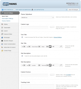
Definition options
Definition Options

There are two things I really like about WooThemes:

  1. Their themes are solid (every one of the PAID themes I tried had some major problem or another, sometimes several).
  2. Their themes have plenty of options, so it is unusual that you have to go down to editing theme files – which easily happened with other themes I have used. Check out the screenshot and note the side tabs – and  most of these have more than one item!

Definition has not disappointed in these aspects, expect for a couple of minor things (a blue bar on the side of the title and Comment buttons when comments are disabled). I have contacted their support, let's see how they respond.

Update: a few hours after my support request they answered both my questions. I had an empty page that for some reason didn't show up on the other theme (so I just added a menu without it), and they sent the CSS to remove the button and divider:

.comments.button {
display: none;
}
.home .post-more-sep {
display: none;
}

Categories
Product Review

Inspectlet review

Inspectlet is a web service that provides heatmaps, real time analytics, and their main selling point, videos of your users in action.

They have a very reasonable free plan – 2500 pageviews, 500 captures for a website. These seem to be split on a daily basis, however. If your site has a reasonably average daily use pattern this might not make a difference.

One nice thing about the free plan is that it covers your whole site. I have used the free Crazyegg plan for a while, and it only collects data for a page at a time.

On my personal trial, it seemed to count 17 videos for the day, but I could only see 7 in their list.

I have used the standard method to add the monitoring to my site – just a few lines of javascript added to the footer. The script is reasonably sized and loads fast.

Videos

Most of my site capture videos are very short – a few seconds. Maybe due to the nature of my site, I found very little useful information viewing them, but it is kind of interesting.

From my limited sampling, their captures seem to be very buggy. I have seen a 375×74 capture in which the user still interacted normally, and I have just seen a video where the user clicks a button and the video displays the wrong page loading (the user then proceeds to click where a button is on another page, and ends in the proper page).

Heatmaps

The eye-tracking heatmap show a visual map that uses the mouse cursor as a substitute for the user eyes. I'm not sure if this makes any sense, but they say there is research that support this. It does seem to match the expected area for my pages.

The click heatmap is just the classical map. Given how poorly it matches the actual clickable areas in the page, it seems like the display is somehow misaligned.

The scroll heatmap uses colors to show how far the users are scrolling down the page.

All heatmaps can be filtered by date (start only).

The heatmap list could really use the number of visits. Otherwise, we just know if a particular page had enough visits to make the information useful by entering each heatmap. For a large site with infrequently visited pages, I imagine this would get pretty bad.

Analytics

I have no idea how these are, as it is not included in the free plan.

Conclusion

Inspectlet still seems a little buggy, but if you ignore that, you get a lot of information on the free plan. The other plans seem to be on par to similar services. I e-mailed support once and they did answer pretty fast.

Overall, I'm still looking. It is interesting to note that Google Analytics now has a simple heatmap system, but it only use links clicked, not actual clicks (if you have several identical links on the page, they all display the same percent of clicks). It also ignores download links and anything that leaves your site. It is completely free for now, though – just go to your site in GA, Content Tab, In-page analytics.

Categories
Product Review

DesignBoost Landing Page Design Course – Review

I just finished watching the last video in the DesignBoost Landing Page Design Course. As you might have guessed from the name, it covers how to build good landing pages (i.e.: that convert well for the audience they are intended for).

I took the course because I'm really not satisfied with my current landing pages (or my regular website), and it seemed like it would help.

The course consists of 24 lessons. Each lesson has one or more videos (mostly streamed online via Vimeo), and there are several PDF worksheets to guide your design work. There is also a large download pack with buttons, background and whole page designs that is quite useful.

During the course there are also links to useful resources and articles.

The course starts with defining landing pages and how to use them, including the importance of keeping them focused. It is much easier to convert a specific audience rather than try to make a single page for everyone that converts poorly for all of them. In that sense, all landing pages should have a single strategic goal and an audience in your mind. If you have several goals or audiences (search traffic, PPC, e-mail campaigns, Facebook,etc) , you should design one for each.

To that purpose, several of the lessons involve how match the traffic to the page, defining the sales funnel and conversion goals.

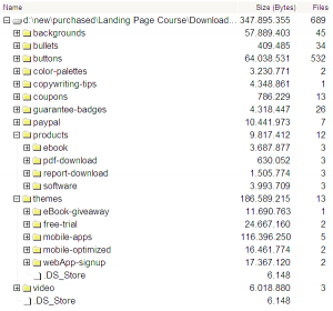
Files in the download pack.

Next the course goes to the page copy, covering headlines, hooks and several tricks to improve conversion (such as using client or download numbers as social boast, testimonials, establishing trust and setting a sense of urgency).

Then it covers layout, design, color and how to use the helper tools and design elements in the download kit that comes with the course.

At this point, if you are following the lessons and assignments with the worksheets you should have a finished landing page design.  The final lessons cover slicing (cutting the page graphical elements to convert to HTML), usability and split testing (for split testing, I have used and recommend Optimizely – see my review for more details).

Overall, the course is well thought and includes a process using worksheets so that for any landing page you need to design, you can just answer the questions and cover the guidelines in the worksheets to follow along. I personally felt that it could have had more coverage of layout options. The download pack is very useful. Given the price and time involved (took me 6 hours not counting the assignments), it is a pretty good deal.

I'll definitely go through my old landing pages now with new eyes.

Categories
Product Review

SEO From Scratch Review

SEO From Scratch is a new video course from Ben Hunt. He is a book author (check my reviews of Save the Pixel and Convert! for more information) and he has a very nice Web Design/SEO course that I took last year and really liked.

SEO from Scratch is mostly targeted at beginners, that shows you the basics of Search Engine Optimization (SEO) and goes up to somewhat advanced techniques.

The course right now has 4 videos, currently totaling about 3 hours (186 minutes), as well as a spreadsheet with tools and a short PDF manual.

1. Introduction, covers the very basics of SEO, and the general process – Keyword Research, Content Creation and Content Promotion. It also covers the awareness ladder, which is covered in more complete form in Convert! (and if you decide not to pick up this course or the complete Web Design I really recommend reading Convert!).

2. Keyword Research covers Ben's method of find good keywords – that is, keywords that get traffic and at the same time are possible to rank for in the top 10. There are a number of programs and services that do this right now, but I'm not aware of any that gets numbers as good as Ben's system (except possibly SEOMoz, from which a lot of the data used in the process comes).

This is the best part of the course, and can't be found anywhere (except on Ben's Web Design/SEO course ).

The big problem with the process is that it is VERY manual. So, while you could easily scan dozens or hundreds of keywords with a tool such as Market Samurai or Rank Tracker (part of SEO PowerSuite), in the same time you'll cover only a few, and have much more work doing it. Is the data you get better? Quite possibly. As far as I can see, the data source – SEOMoz –  is simply better than what others use.

There was some talk in the course forums about an automatic service, but I don't think it is available yet. I might eventually get around to doing that myself :-).

3. Content . Once you get your keywords, you will want to create or optimize your content, to get visits and links to your site . This video shows you several ideas on how to do that. I also recommend The Web Content Recipe Book for ideas and great guidelines on how to do it.

4. Promotion . Once you got your content out, there are many ways to get it out there. This covers a few of them, such as social sites, link building and e-mail lists.

It also covers the spreadsheet system for getting rank tracking. Rank Tracking is useful so that you can see what is working and where you should spend more time to maximize your return. The method described here is free, but I think Rank Tracker – part of SEO PowerSuite – is a better tool, specially now that it can show you expected visits as well as pull data from your actual visits from Google Analytics.

Overall, the course is pretty good, specially for beginners. You also get updates for an year. Since the course had many videos offered over time, I expect to see a few. I'll update this article as I watch them.

[button link=”http://www.prowebdesigncourse.com/amember/signup.php?price_group=3&hide_paysys=paypal_r&r=127 ” color=”teal”]Get the course now[/button]

Update (19/Apr/2013): This link doesn't work right now. I think the course is only part of the Web Design course now. The course is pretty good, but might be overkill if all you want to learn is SEO. If you are still interested, check my review on Ben's Web Design/SEO course .

Categories
Product Review

SEO PowerSuite and new Google Analytics features

SEO PowerSuite BoxSEO PowerSuite has added some cool new Google Analytics features .

You can now see:

– visits per keyword on Rank Tracker

– visits per backlink on SEO Spyglass, and also uses Google Analytics as a backlink source.

– visits per page on WebSite Auditor.

Overall, VERY cool.

Categories
Product Review

TurnJs – Javascript based page turn effect

Turn.js is a JQuery Plugin that adds a turning page transition on HTML 5, with hardware acceleration support.

Looks pretty cool!

Categories
Product Review

MailChimp and Attached files

Mailchimp has a new, neat integration with Digioh that allows you to share files with your newsletter audience.

It also generates unique links so that you can track exactly who downloaded your files, as well as other stats.

Categories
Product Review

How to Create an Awesome Demo Video for Your Business – Miguel Hernandez – Course Review

I have just finished watching How to Create an Awesome Demo Video for Your Business , by Miguel Hernandez.

Miguel Hernandez' company is GrumoMedia. They have an interesting style for their videos – they are at the same time fun to watch, informative, and they sell the product very well. You can see the sample below. The course purpose is teaching you how to create your videos – the Grumo Way.

Course Sections

  • Script Writing – this covers writing a fun, easy to animate script. Taking your time with the script is important, because changes on the animation or voiceover will take much more time and money than changes in the script.
  • Storyboarding – shows the concept and voiceover for all the animation.
  • Voiceover – how to get good narration on your video.
  • Illustration – drawing for the video, in a way that is easy to animate. Also suggests which tablets and software to use.
  • Animation – covers hardware and software, as well as animating in After Effects.
  • Sound Design – how to find good stock sounds or make your own, and how to create your own music.
  • Editing – using Final Cut Pro.
  • Delivering – encoding and sending your videos to YouTube, Vimeo and others.
  • Promoting – using Facebook, YouTube, Vimeo and other tools for your video promotion.

Conclusion

I enjoyed watching this course. It covers all the steps of making a video, from the script to promotion.

The style of the videos is very friendly, and covers all subjects in a simple language. I really like that you can download the videos- several video players can play at a faster rate, which can really save time. I watched several of the lessons at 1.6x.

I have made a couple of videos before, but the screencast kind (see my Print Folder video for an example) – just a plain display of an application at work with text explanations. I do believe the kind of video they teach in this course can get better conversion rates, and is much more likely to be shared.

Personally, I think that the course is a little expensive (I only got it because of a promotion at Appsumo), but if you really plan on making videos for your business or AS a business, that price will probably pay itself back very soon.

[big_button color=”blue” url=”http://ude.my/zJy33X” desc=””]See a free video from the course[/big_button]