Stanford Online AI Classes
This year, a whole batch of free online classes became available from Stanford professors. I've always been interested in AI, and so I took Introduction to Artificial Intelligence and Machine Learning .
Both courses cover AI, but the first does more of a tour of the field, covering a lot of topics. The second is only about Machine Learning, which covers algorithms that can learn from existing data. There are many applications – recommendation systems, search engines, computer vision, OCR, speech recognition, and much more.
The classes were video based, usually with subtitles available. One interesting thing about the Machine Learning course is that you had downloadable PDF notes of each class, and also that you could view the videos at 1.2 or 1.5x speed – a big time saver.
I liked both courses, although Machine Learning does come across as more immediately useful given its more practical nature. It also had practical programming exercises (in Octave).
For Introduction to AI, some of the most interesting modules were right at the end, when the tools you needed were already presented – Natural Language Processing and Robotics (including some cool stuff about how Google's self driving car works).
I can recommend both courses if you are interested in AI.
I'll also be taking the Natural Language Processing next year.
Ben Hunt’s Web Design Course Review
This year I took Ben Hunt's Pro Web Design Course. I learned a lot from it – and was able to raise my websites' ranking for several keywords, and got some extra traffic too.
The main reason I took the course was after reading Ben's books Save the Pixel, Convert! and seeing his videos on websiteworks.tv.
There are a lot of good ideas on those books and videos, and good SEO analysis of both a page factors and potential competition for keywords is very important.
The course consists mostly of videos, although there are some downloadable page examples and resources. The videos are downloadable, which is nice for a couple of reasons – first, you can keep them after you are done with the course, and second, you can download and watch them with a player such as GOMPlayer, which allows you to view them at a fast speed. I used 1.2x most of the time, and on subjects I already mostly knew, I'd use 1.5x. That can save quite a bit of your time.
The explanations on the videos are quite clear. The main objective of the course is teaching Web Design as a profession. But if you make your own website (as I do), you can still use almost everything.
The classes range from basic HTML, designing on PhotoShop – pages, buttons and other elements, basic Javascript and PHP, a lot on WordPress – specially designing themes, and a very important and under represented theme, good SEO on page design, keyword research and landing pages. In my opinion, this is one of the strongest areas in the course.
One interesting thing is that the course is constantly receiving small updates. In SEO, which changes all the time, this is really important.
The only thing I really thing is missing in the course are transcripts from the videos.
If you actually want to become a professional Web Designer you also get many useful lessons on the specifics of the business, such as specialization, handling your clients and business strategies. And I believe the SEO training is invaluable – too many web designers make pages that rank miserably because they don't grasp more than the basics (and sometimes not even them).
Overall, I can really recommend this course for both Web Designers and people with sites that they want to improve.
Check out Ben Hunt's Pro Web Design Course
Update (25/June/2013): All videos from Websiteworks.tv were added to the course! These are the reason I got on the course in the first place. They consist of SEO, copy and design analysis of sites, and are full of great information and ideas . Some Marketing MasterClass webinars and other were added too. But please note that if you get the monthly version of the course, these are only available after 6 months!


You can quickly make Web Albums with STGThumb.
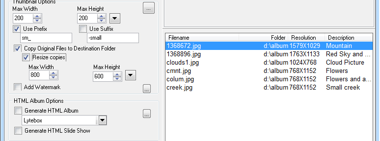
While you can easily tell from the name that thumbnails were the main idea when I first developed STGThumb, very soon users started to request a Web Album feature.
It couldn't be easier to make online photo albums with STGThumb. Just choose the photos you want, click Generate HTML Album and your photo album is ready to upload.
Other album maker options are several Album styles:
Vertical Style HTML Album
Classic Style HTML Album
Horizontal Style HTML Album
Lytebox Style HTML Album
HTML Slide Show
Classic Album with CSS Instant Photo Effect
[big_button color=”blue” url=”http://www.stgsys.net/files/stgthumb.exe” desc=””]Download Now[/big_button]
Interesting article on how to customize the text on your excerpts more link:
The Art of Readable Code – Simple and Practical Techniques for Writing Better Code – by Dustin Boswell and Trevor Foucher – is a book on advice on making your code more readable.
Why would you want your code to be more readable? It might not seem so important while you are coding, specially if you are a solo developer like me. But when you next have to change or debug something in your code, you will be grateful that you spent the extra time. Not only that, but it is much easier to find bugs on readable code.
One book I will always remember is Code Complete, by Steve McConnell. I read it the year after I finished university, and I immediately loved it. It was full of useful techniques and ideas on how to make your code better – more readable, less error prone, better formatted, etc. And it used plenty of studies to demonstrate what really worked.
I bought The Art of Readable Code half expecting it to be a poor version of Code Complete. I was very pleasantly surprised to find to be not only a nice, fun read but also full of interesting ideas and excellent examples.
When I finished, my Kindle version was full of highlights and bookmarked pages.
Highly recommended.
The Developer’s Code – Book Review

The Developer's Code – What Real Programmers Do – by Ka Wai Cheung is supposed to contain “nuggets of wisdow” on how to sustain a healthy relationship with your work.
Overall, I found a few interesting tidbits on the whole thing. It is a relatively pleasant read and worth the time to read it and the price of the book.
What I liked:
– The Parallels between architecture and developing – and why some of the architectural metaphors can make planning excessive for software
– Perk can be destructive for higher-level thinking (according to a TED talk from Dan Pink on motivation)
– If you can, start writing the most interesting part of o program and work out from there
– First impressions of a program can be skewed because we don't know how we will conform to it
– Suggestions on how to schedule pet projects
– Make two things better about the software each day – even if they are small items such as better error messages and comments
– Some techniques for handling your to-dos
– the off-time concept – where for two hour shift per developer, there are no interruptions
– the generals ideas on code generation.
http://wpmu.org/googlyzer-for-wordpress-puts-the-power-of-google-analytics-in-your-admin-dashboard/
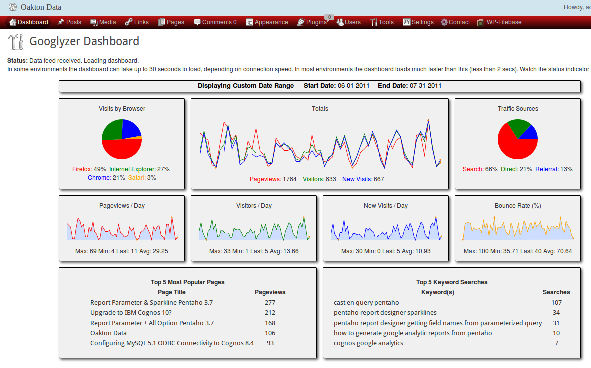
Wouldn't it be great to be able to access your WordPress site's Google analytics right from your dashboard? Well now you can with the Googlyzer plugin. This sweet tool makes it super simple to view key Google analytics within your WordPress[…]
Usability Bundle
The World Usability Day Bundle site is now available.
It has a lot of usually expensive usability tools with a huge US$3800 discount (well, US$3950 if you use the link above – you get a US$150 extra discount).
Of course, that is still US$1220, but for serious usability professionals this is pretty cheap.
If you are interested, you should hurry as it is only available for 2 days.
Go to World Usability Day Bundle site to get the discount.

Killer Headlines for Web Content, by Nick Osborne is an e-book by WordTracker.
It is more of a report than a book, at 65 pages. This is a problem in the sense that it limits the amount of content it covers, but it also makes it a quick read.
The book proposes to cover a few approaches so that you can write better headlines.
It does have good suggestions – mostly the classic approaches (numbered lists, fear, how to, etc) – but it does feel quite oriented for news and generic articles, rather than business content. It does mention this in the Introduction, and says that these headlines work, and it is your job to fit it to your pages and articles to make them work.
I feel that the approaches were reasonably well covered, and it did give me a few ideas. I might even look at my notes when I'm looking for a good headline.
At the current discounted price – US$19 – I feel that the book is worth its price, but I wouldn't recommend it at its full price.


