Categories
Product Review

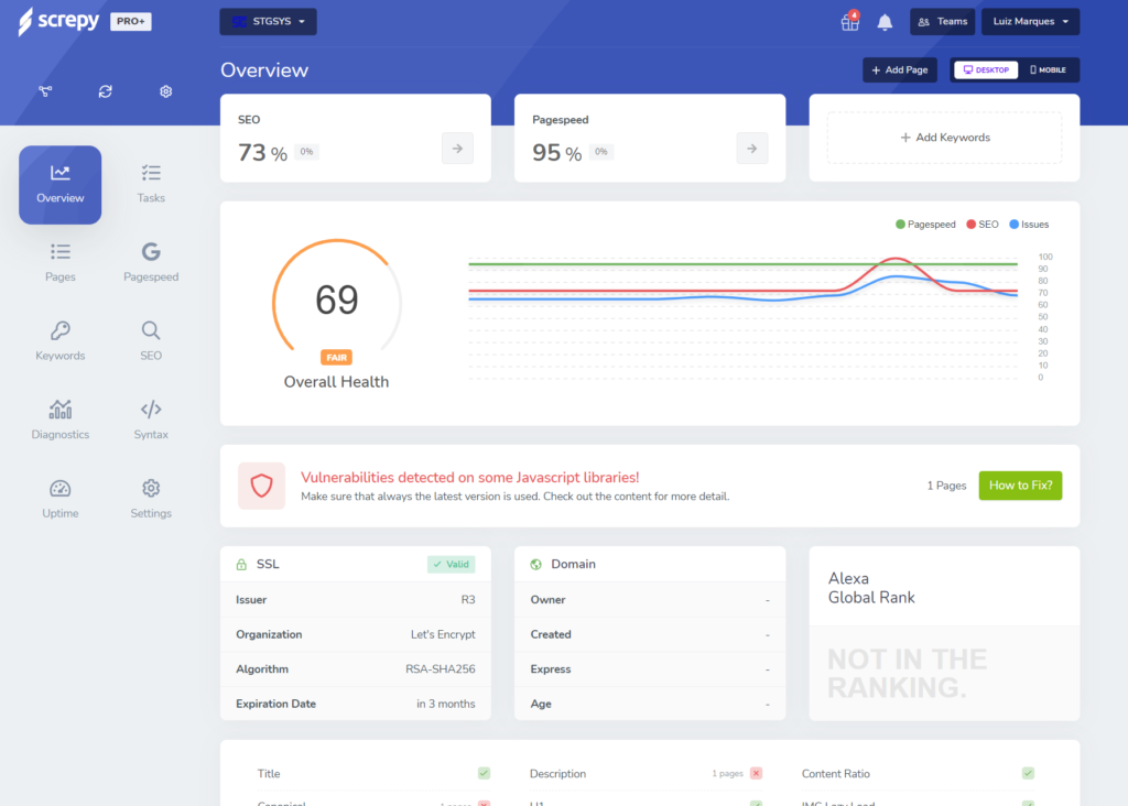
Screpy – Product Review

Screpy is a tool that scans your websites and gives you a lot of information on it.

It has:

  • List of your pages
  • Page speed for all your pages
  • Keyword Tracking (with support for specific locations, which can be useful, for obvious reasons)
  • SEO reports (it certainly found a lot of stuff in my main site) – it is supposed to be AI-Enhanced, but I have no idea what that is in this case.
  • Syntax Issues
  • Uptime tracking
  • Vulnerability tracking!
  • Real-time e-mails
  • AI-Content analysis
  • Finding keywords and keyword clusters

I just got it, but I really like it so far. It looks amazing (I wish my site looked like this…), and it has a ton of suggestions (many, unfortunately, that I already knew I had to get around to), and also some I had no idea.

Some of the tasks it added:

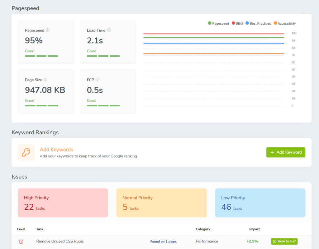
  • Removed Unused CSS Rules
  • Removed Unused Javascript
  • Broken canonical link
  • Meta Description not found
  • Use responsive images
  • Too Small Font Sizes
  • Tap Targets
  • and a whole lot more (they have priorities too, which seems like a good idea on a list that big)

There are very large explanation boxes in each of those items, too.

The dashboard view is pretty much excellent, and shows a lot of information. I'd add more graphics, but right now it is kind of embarrassing…
I actually already had tools that supposedly did pretty much everything this does, in one form or another, but their approach and the ability to do all of that in a single place is great.

So far, all the suggestions I've seen make sense (which has NOT always been the case with other tools – a lot of false positives here and there).

Also, some had subscriptions, which I won't need anymore…

It seems to have a lot of video tutorials, which is good, because there is a lot I don't know how to get to yet (unfortunately I can't seem to full screen some of these, so they are super tiny and hard to see…).

Not surprisingly, they have various limits on numbers of pages, projects, etc depending on the level you subscribe at. I got the basic Appsumo subscription, which seemed adequate for my purposes. Another thing that changes with your user level is the time for analysis to repeat, in my case it is 7 days and supposedly it will also look for new pages, which is obviously better than having to go back to do manual refreshes.

Categories
Product Review

Pluralsight – “New Course Available”

It is a small UI change, but with big consequences for the user:

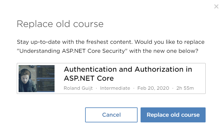
When you are looking at channels (their version of bookmarks), “New Course Available” might appear. If you click on it, you get a box like this:

So you learn about the new course, avoid wasting time viewing outdated material and replace it on your channel in seconds. And if for some reason you actually wanted the outdated material (if you are using an outdated version of a product, for example), it is still there.

Very, very clever.

Categories
Product Review

HelpXPlain – Product Review

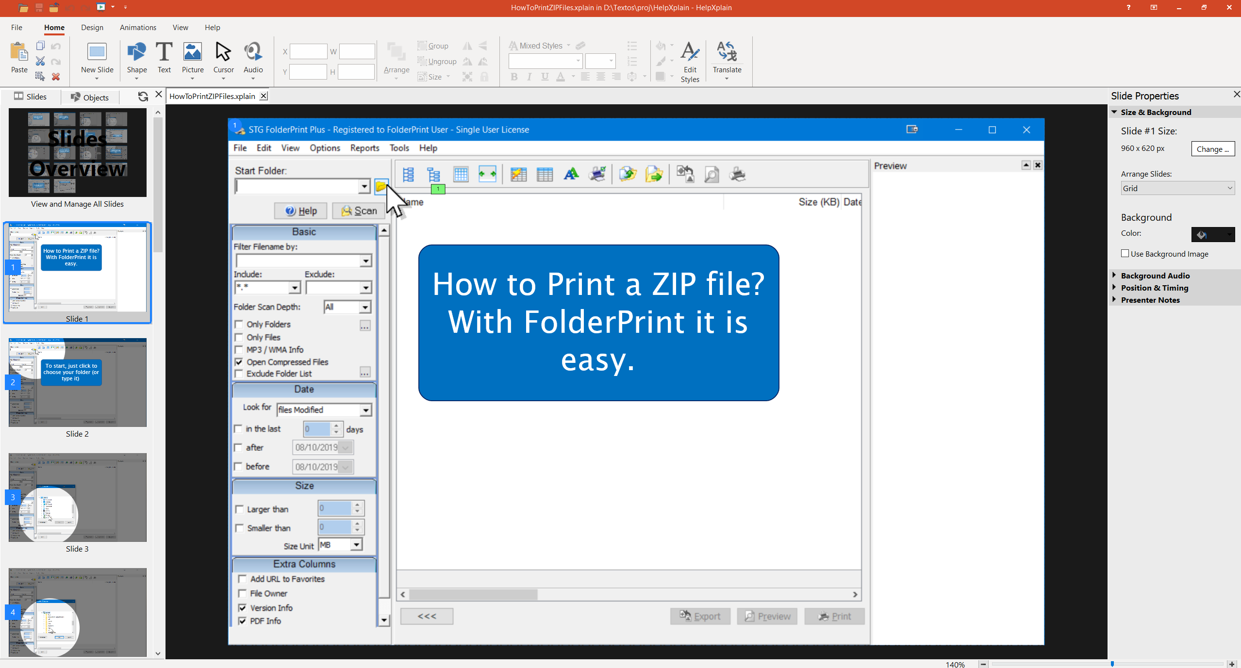
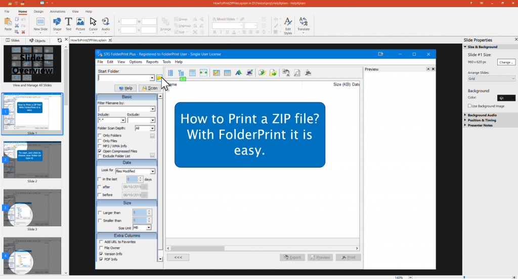
HelpXPlain is a tool for making “videos” with step by step explanations, and screencasts. They are not really videos – it uses Javascript and images to make something that looks like a video, but is much smaller and more fluid.

If perhaps you used something like Instant Demo (which hasn't been updated for a while), you have seen this before. The big detail is that this kind of program used Flash for output, which is a big no-no right now, as it is not on by default and will be retired completely by the end of the year.

I actually used the program the first day after the release (and bought it shortly after) but I didn't post a review as I hadn't done a full video with it.

Now I have – just a page that only had a description of a process – How to Print a ZIP file .

So, what is nice about HelpXPlain vs Instant Demo? First, the HTML/JS output, and second, it is mostly easier to edit your screencasts in. They are mostly a bunch of slides, which you can easily remove or duplicate.

Of course, I am not great at this – there are some awkward pauses in my screencast – but I think it took me about an hour, while working on the script and learning the program, which I think is just fine.

Size and responsiveness are pretty great for me. Adding the screencast is a bit harder than a YouTube video, but the simpler way is just a few lines of HTML and uploading a few files (it adds to 4.6 MB, 28 files).

One very nice thing is that you can also add the screencast to Help files. HelpXPlain is made by the same company as Help+Manual, which I really like, and have used for years. While most software now consider Help files outdated, I still like them (and you can post them online, anyway – they have search and everything). It also supports translation (as separate projects), with paid AI translation support. I didn't try that, though.

Overall, I really like it, specially considering how new it is. Very much worth considering for your screencast or support videos.

PS: They don't have an affiliate program (that I know of), so I don't get anything from this review.

HelpXPlain Screenshot

Categories
Product Review

DevExpress MVVM WPF Framework

I have recently started using DevExpress' MVVM WPF Framework.

I really like it. The amount of code you get to skip vs regular MVVM is huge. For example (I use the POCO ViewModel based system), to add a command just add a public method. Need it be on/off based on some conditions? Just add a bool method with Can*CommandName* to your class.

Behind the scenes it generates a new class with everything it needs.

This applies to many other things, including a bunch of services that are very easy to use including, including reporting, file and folder dialogs, wizards, navigation and much more.

It is also free (without support), or included with support on their WPF components (which are pretty nice too).

There are a couple of videos that show some of the basics and the nice advantages:

Please note that so far I have not used other WPF MVVM frameworks other than plain MVVM, so I can't compare them to DevExpress.

Categories
Product Review

Safari Learning Paths New Interface

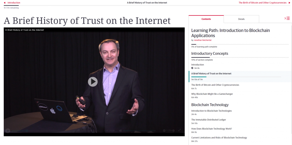
I really like the new Safari Learning Path interface.

It is a bunch of small things – specially the time marker on the top and the section time on the right.

The clean design is nice too, and the video player works well.

One thing that still didn't change is that a whole lot of stuff in Safari (including a lot of conferences videos) have no closed captions. Given how many AI services support this, I'm little surprised that this didn't change…

My full review of Safari.


Categories
Product Review

.NET Micro ORMs – Course Review

Just finished .NET Micro ORMs, by Steve Michelotti, on PluralSight.

This course covers a few Micro ORMs for .NET – including Dapper, OrmLite, Massive, PetaPoco and Simple.Data.

It was very interesting to see how easy they are to use, and how fast they are, compared to Entity Framework.

From my very limited experience, the best for me seems to be OrmLite – which is not surprisingly a paid product (although it has a free version for up to 10 tables in a project, which can work in some situations).

All the others seem very interesting, though.


Categories
Product Review

WPF MVVM In Depth: Course Review

WPF MVVM In Depth is a PluralSight course by Brian Noyes that covers using the MVVM pattern (Model/View/ViewModel pattern) in WPF.

I really like the way MVVM cleanly separates concerns. Great for re-usability and unit testing. It also goes pretty nice with WPF.

I have taken some of Brian Noyes courses before, and as usual this one was pretty clear and had very useful examples to follow along.

Overall, very much recommend if you are interested in MVVM in WPF.


Categories
Product Review

WPF Productivity Playbook

Just finished WPF Productivity Playbook on PluralSight.

Lots of smaller productivity details I didn't know in WPF, as well as examples of several other things you can do with WPF.

Very interesting, and very well presented. My only complaint would be that there are no captions.

Got to say that the more I learn about it, the more I like WPF. Too bad that MS seems to be phasing it out…


Categories
Product Review

Principles of Game Design – Course Review

I recently completed the course Principles of Game Design, on Coursera, from Michigan State University. This course is part of the Game Design and Development Specialization.

I have reviewed the first course in the series – Introduction to Game Development .

This one covers how to design games – having game ideas, creating a story, characters and most of all good gameplay.

It is far less practical than the first, given its nature, although you are supposed to make a prototype of your game for the final assignment.

I took the free version, which unlike the first course, doesn't have quizzes and you can't turn in assignments (of course, you are free to make and evaluate then on your own).

One thing I particularly liked is that every video has a linked transcription. If you read faster than the video, on most classes in this course (which has little graphical supporting material, most of the time), this is much faster. The course also had plenty of links to books, articles and papers on the topics covered, many which great coverage.

The course was interesting, and I've learned a lot. The thing is, one of the books they suggested – Fundamentals of Game Design, by Ernest Adams – is so good that reading the equivalent book chapter always felt better than the course lesson. And as a plus for me, it was already included in Safari, which I already subscribed to (so it is practically free).

Of course, while the book is also filled with exercises, you get no feedback from it (but the feedback from the course, if it is like the first, is just from students, not teachers or TAs). You also don't get a certificate. So keep all of that in mind. In my case, I feel the book is substantially better.


Categories
Product Review

Quick Start To Unity – Course Review

Quick Start to Unity is a learning path on PluralSight/DigitalTutors that shows some of the basics of getting around in Unity and making a simple game.

There are about 3 hours of video content (although I took a couple of hours more, as I followed along in Unity and took notes).

I felt the focus was pretty good. I took it after the much longer Coursera Course, Introduction to Game Development . It doesn't cover everything from the course, but it has a nice set and several things that weren't covered in it.

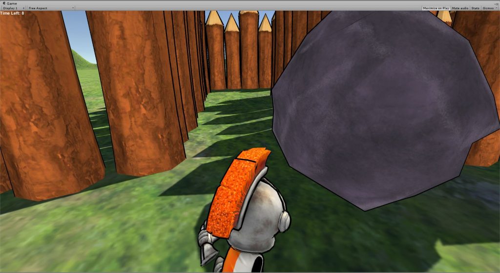
In particular, there were plenty of small tips on how to get better looks (the course is apparently a bit more target toward artists). The completed project is quite simple, but looks quite nice.

Quick Start To Unit Course Final Project

What I didn't like:

  • the course is for Unity 4, and there is no information on how to make things work with Unity 5. So several times I'd have to Google how to do things. Some text on the bottom from the author with the changes would be great.
  • The video player doesn't allow speeding.

Overall, it is pretty interesting if you already have a Pluralsight subscription, or if you use their trial.